Product · Identity · Systems
Transforming visual identity into a human, usable experience.
The challenge
With no product, no defined identity, and a white-label brand as the only starting point, I had to design Qik's banking experience from the ground up.
My role began focused on UI, but the lack of a clear visual direction led me to take on the full definition of the look & feel — while the product, the team, and expectations all grew at the same time.
The challenge wasn't just visual: we needed to build an accessible, fast, and simple experience capable of bringing banking to people the traditional financial system had never reached.
Project summary.
Role
Senior UI Designer
Tools
Figma
Duration
4+ years and counting.
Principles
Trust · Modernity · Simplicity
Product
Qik Digital Bank App
Key outcome
A foundation that evolved into Cobalt Design System
Principles behind the look & feel
functional aesthetics
The look & feel was built on clear principles:
- Visual hierarchy to support reading and navigation.
- Contrast and color use to guide attention.
- Consistent spacing to create breathing room and clarity.
- Repeatable patterns that reduce cognitive friction.
I aimed for the app to convey Trust, Modernity, and Simplicity. Qik needed to feel light, accessible, and different from the traditional banking experience.
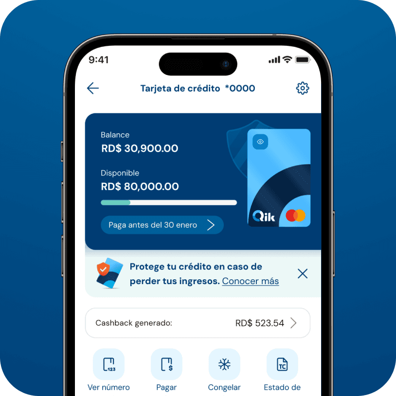
A clean, intuitive interface was designed — with one thing always in mind: we're designing a bank.
Animations and micro-interactions were applied at key moments to reduce anxiety.
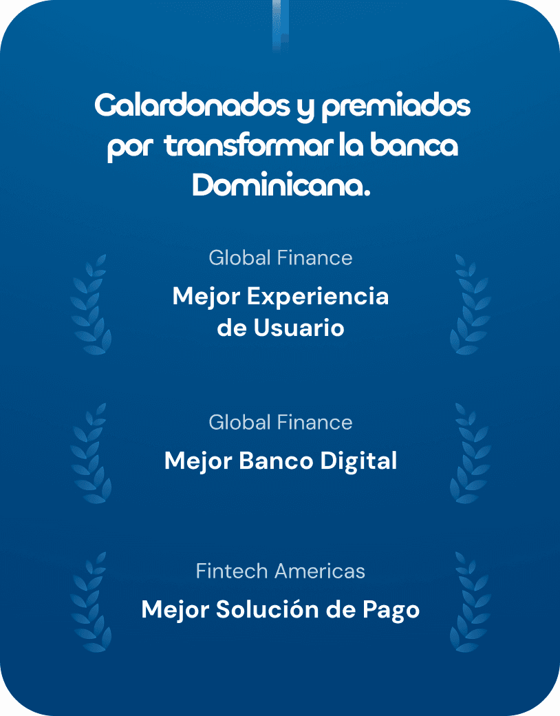
The look & feel work didn't start by improving something existing — it started by building a clear, modern, and accessible banking experience from scratch.
Design decisions
Through visual decisions like typographic hierarchy, contrast, spacing, and repeatable patterns, the product conveyed a sense of trust and simplicity from the very first interaction.
The team began working with greater visual clarity and confidence, while the app started standing out for its cleanliness and coherence.
On social media and in conversations with users, one of the most recurring comments has been how simple, intuitive, and different from traditional banking Qik feels.
More than an interface, design helped create a usable experience where the visual layer naturally guides interaction.
The learning
Seeing the app running for the first time during the launch event is a moment that's hard to describe.
I felt a mix of pride and emotion watching something that started as ideas and visual decisions become a real tool that impacts the lives of thousands of people.
Beyond the system or the structure, what fills me most is hearing that Qik is perceived as simple, clear, and well thought out. Knowing that something I designed today is part of Dominican users' daily lives reminds me why I do what I do.
For me, design makes sense when it stops being just a screen and becomes an experience people actually use and value.